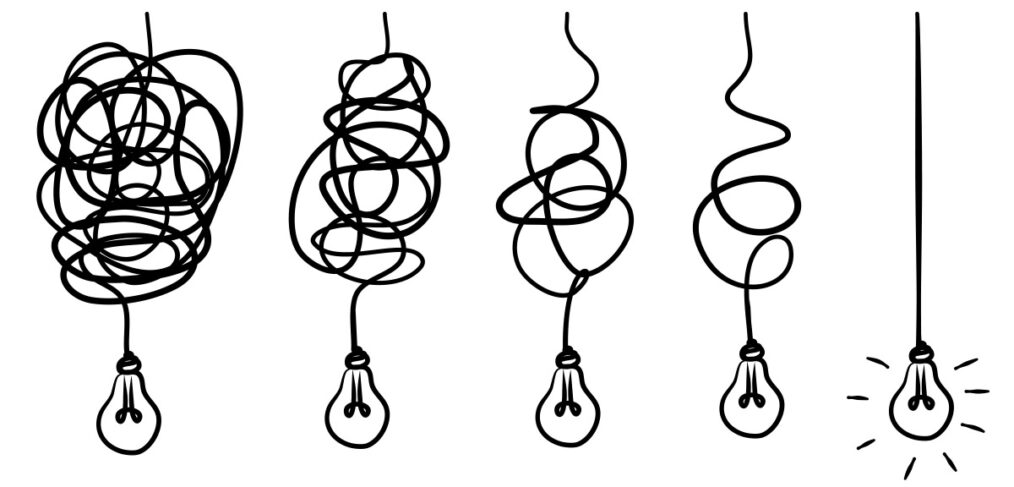
Simplicity Is the Only Option
I rented a car recently from a major American rental car company. You should know that whenever I rent cars, it’s often from the same company, and I always pick them up at the airport. I don’t like messy. And I value anything that makes the difference (for me, at least) in whether I continue to do business with a company or a person: Did they make it easy for me to do business with them? In this case, the counter rep was great and fast, the guy who met me at the door of the parking deck was courteous and let me pick whatever I wanted. I got in the car and drove away. Simple. No thinking, no hassle.
That’s the same experience you want your target to have when they pick your postcard out of the mailbox, or from the pile of mail on their desk. You must make it easy for them. I’ve got 5 Simplicity Impacts that will help drive adoption and increase the number of leads and sales you’ll generate from your direct mail postcard campaign:
- Sketch It Out First – The fancy term is a copywriter’s rough, but you’re really just imagining where you want everything to go on the postcard. Does it make sense where it is? Is the placement of the copy or the picture or the logo where it should be? Pick your colors and make sure they don’t clash – especially with your logo! Is there a headline? Should there be? (We all know the answer is YES!) Have you put too many things on the postcard? Is there too much to wade through, look at or read? Stuff like that.
- The headline and body need to be friends – Immediately! – This is the first connection the reader will have to the postcard after taking in the imagery. They’ll look at the pictures and then determine if it’s worth reading. If the headline and the body of the postcard don’t match, you have a problem, a disconnection…no matter how creative or visually stunning the pictures are. Mismatched headline and body on a postcard are the equivalent of dead air on the radio. Never, never, never.
- Dumb it down – In a famous speech by Malcolm X, he said that he wanted to talk right down to earth in a language that everybody [here] can easily understand. It can’t be made simpler than that. You need to capitalize on the moments you have with your prospect as they evaluate your postcard. Large words, wordy sentences, or complexities of ANY kind will turn them off. Keep the language and approach simple, attractive. The easier you can make it for the reader to absorb your message, and to entice them to move toward your CTA, the faster you can realize the benefit of the postcard (leads or sales), and better you’ll be received by the reader.
- Lead the prospect to water – You want them…you need them…to take you up on the CTA, but you must get them there first. In sketching out the postcard, can you tell if you’re directing the reader? Or are you simply giving them information with which to form their own opinion? Do the work for the reader, make the connections as they read, and make that CTA even more compelling and unavoidable.
- Drive the Benefits home – Emphasize the benefit over the feature. Tell them how the solution will make their life easier. The reader is thinking WIIFM? What’s In It For Me? Tell them. Make this prominent and highlighted. Even if your product has a premium price point, if you’re presenting the target with something that will help them be better or do better, that’s what you’re selling and that’s what you need to put front and center.
I rent from the same company because they make my job of renting a car their job. And they know that if they make it easy for me, that translates to future sales. It’s genius.
Give Opportunity Knocks a call. Those are only five things I think are most impactful in terms of keeping it simple for your target. We got Success Coaches standing by to walk you to through every step of designing a productive, powerful postcard campaign. There are many more things to consider, but if you can create an amazing, far-reaching postcard campaign with these basics, you’ll go far. Simply.
