Simple, Effective, and WINNING Postcard Design!
My 80-year-old father was a semi-professional photographer (when he wasn’t doing his day job at IBM for 45 years). And I have a friend whose 13-year-old daughter is also a photographer. They both take pictures of varying subject matter, and they both have an amazing ability to make you feel like you are part of their vision, be it an elk standing in a wintry Colorado field, or the tender, wrinkled skin of a grandmother in the shade of giant oak tree at a family reunion.
What they each have mastered is the art of composition. They know exactly what it takes to bring your eye toward what they want you to see. And often, their pictures will bring unsolicited emotions of joy or excitement or wonderment from you.
Believe it or not, you can do the same thing with a postcard! It’s all about focusing the eyes to see what you want the prospect to see. By utilizing these 7 Design Tips for a Winning Postcard, you, too, can compose an image that speaks directly to the needs of your prospect:
- Know Your Audience – This isn’t that difficult, but at the same time it can be hard to narrow down to whom you want to (or need to) speak. First, consider your objective. Lead generation, sales, a general announcement? The audience is going to dictate a lot of the wording and graphics for your postcard.
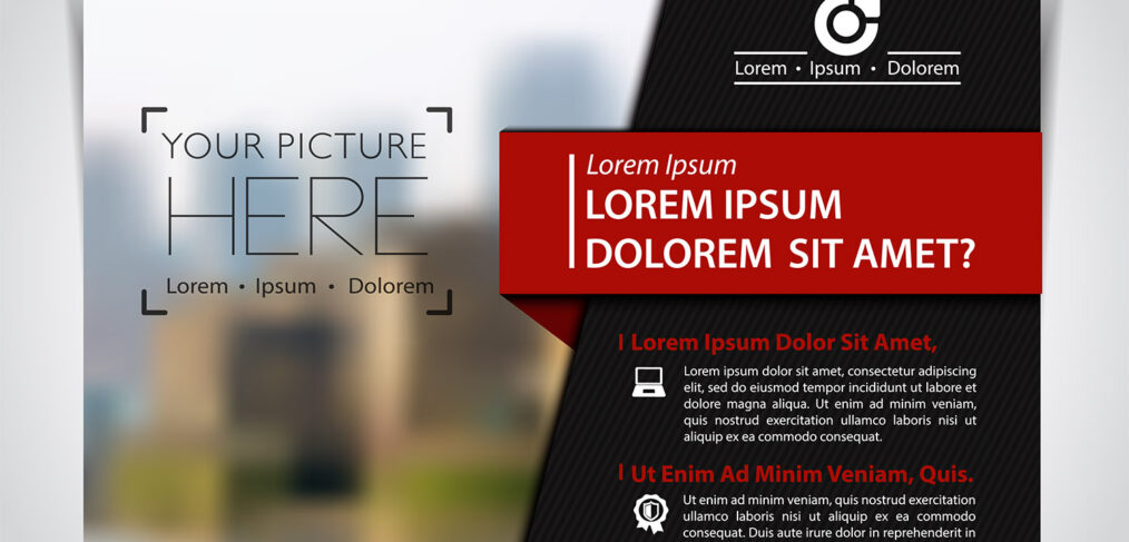
- “Look at Me!” – Do not be afraid to stand out from the crowd in their mailbox. Other than loud colors (which you’ll really want to think twice about), you need to consider using bullet points, underlining, italics, and everybody’s favorite, BOLD, to put emphasis on the bits you want the reader to absolutely see and remember.
- In A Box to the Left – Beyoncé wants all your stuff in a box to the left. I don’t care where it goes on your postcard, as long as it’s effective and looks like it belongs. Use it to box in things like dates, addresses, or a hint about the offer! Box in the Call-to-Action and make it obvious what you want the reader to do.
- The Reader’s Needs Above All – As business owners, we are here but for the grace of the client. Ensure that the copy speaks to solving their issues, addressing their needs, and discovering remedies they’re seeking. Put them first, get them in the door, and save the bragging about sales or client reviews for when you have a commitment for the ‘next step’.
- Build Curiosity – There are times when you need to pull a prospect to you. Maybe you have a complicated product or service. Maybe it takes more than the copy on a postcard to fully explain how to eliminate their problem. Entice them into learning more. Targeted mailing to the right audience will put you on the right path. Copy that shows them you know what you’re talking about, and also makes them wonder how you can really solve their issue, can make them curious enough to give you a call or send you an email or go to your Landing Page!
- Short & Simple – Because you are physically limited by the space of a postcard, no matter its dimensions, and because you need to make the font large enough for a reasonable reader to see, you need to get to it…and fast. Use something like a Landing Page to go into more detail or ask them for more information.
- Be Clear, Be Direct, Be Specific – If you hate rambling and blathering copy, trust that your readers do, as well. Time disappears quickly when someone is standing at their mailbox or their kitchen counter. Your company is being judged in a matter of seconds, so be sure that you effectively communicate what you can do for the reader. That postcard needs to instantly connect with them. Complicated and overdone messaging will fast-track you right to the trash.
Give Opportunity Knocks a call today. We’ve got Success Coaches standing by to help you frame winning postcards. Never underestimate the power of truly impactful design. With thoughtful composition, we can help you and your business prosper!