What Goes into Great Postcard Design
Let’s do some ‘backward math’ for a moment. That’s what I do when I need to back into something, like ‘when should I leave for the airport to make my flight?’ or ‘when do I need to start cleaning before my guests arrive?’, etc. In this case, we’re not looking at a matter of time; our starting point is much broader than that. We want to know what it’ll take for our postcard to get noticed. That’s it. Because if it’s noticed, we have an exponentially greater chance that it will also be actionable.
But where to start? How do we ensure that the last step of the process is either a sale or a lead (e.g., request for more information)? In this case, our backward math leads us right back to the design. And not just the overall design, but the minute details of the design. What do we need to include to make the reader pause, read, evaluate, and rock that Call to Action? Start with these Must-Have Elements of Postcard Design:
- Most postcards are illustrated in some way: Whether you use an actual photograph, some abstract artwork, or a graphic design, you want to grab the attention of your reader. Make them wonder what they’re looking at just long enough to pull them toward what you want them to read – be it the headline or actual copy.
- Skip the aggressive charts and diagrams: Those don’t tend to translate well to a postcard given the size of the font, etc. At most, you’ll want to let them distinguish between a short list of Pros and Cons (like one or two). But don’t have them trying to decipher a pie chart or graph. [Besides, you never want a reader ‘doing the math’ while they’re reading. Tell them what you want them to know. And get out.]
- Templated layouts: These are GREAT, especially because what we know you’re going to do is test the postcard campaign. Is it the copy or the picture that makes one postcard more ‘productive’ than another? By using a templated approach and slotting in a different picture (e.g., one for every kind of product you’re selling) you keep the control in the format, but vary one or two things to understand how your postcard hits.
- Color is essential, but a rainbow is not: Kermit the Frog sang about ‘The Rainbow Connection’, but that is absolutely not what you want on your postcard. Color selection goes a long way in attracting AND repulsing a reader.
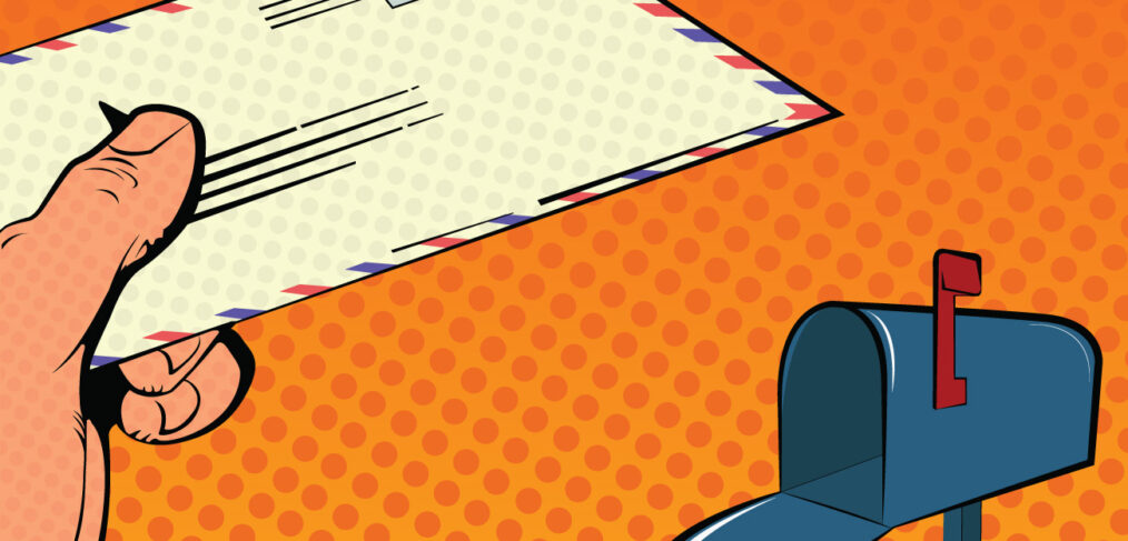
- Looks too ‘official’? Be careful: We’ve probably all groaned after receiving a postcard (or worse, an envelope) in the mail only to dig in and realize it isn’t from the government. It might be cute to try and mimic official government design, but it can quickly get you into trouble not only with your target audience – but with the government, itself. Be clever, be inventive, but never put yourself in a position to lose face with your readers, or have Uncle Sam knocking on your door for any untoward reason.
This isn’t an exhaustive list, by any means. There are tons of elements you can consider when it comes to the design of your postcard, and how you want to position yourself and your company in front of your target audience. But understand that there are just as many (if not more) pitfalls in what contributes to a well-received design as there are in what can make a reader put you – and your ROI – right in the trash.
Simplicity and directness are great, yes. But there are times when some flash in the pan goes a long way in selling your product or service. You’ve done the research into your audience. Now you just have to read the room and match the product and design to their demographic.
Give Opportunity Knocks a call today. Our Success Coaches and standing by (with a little backward math of their own), ready to help you lay out a brilliant postcard campaign from start to finish!